Color Systems in Product Design
A simple guide to using color without making your UI messy
August 13, 2026 · 5 min read
Have you ever opened a design file and found 20 different shades of the same blue?
One blue for buttons. Another for links. Another for hover. And somehow... another blue for errors. 😅
That's exactly why we need a color system.
A good color system isn't about picking pretty colors. It's about giving every color a job, so the interface feels consistent, clear, and easy to understand.
Let's get into it.
1. Start with a Color Palette
Pick a small set of colors and build from there.
You don't need 50 colors to design a good product.
A basic system can start with:
Neutral (Grayscale)
Static
Text
Background
Accent
Divider
Sucess
Warning
Error
The goal is simple: every color should have a reason to exist.
Design Tip: Start small. Add colors only when you actually need them.
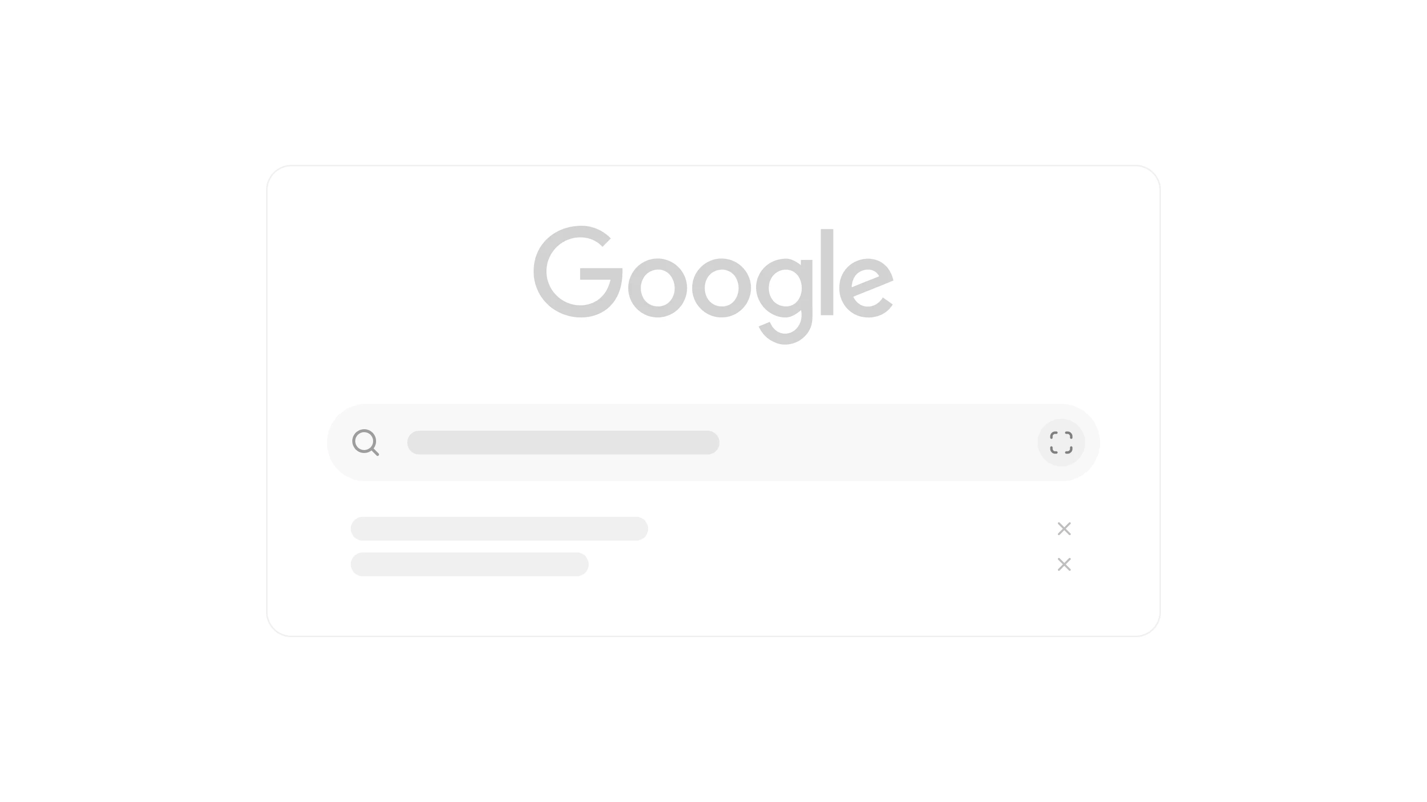
The simpler the first decision, the faster users can get started. Google doesn't overwhelm you with options—it gives you one obvious place to begin.
2. Fitts's Law
Make important actions easy to reach.

People interact faster with buttons that are larger and closer to where their fingers naturally rest.
Think about Apple's bottom navigation or Instagram's floating "+" button. They're easy to tap because they're exactly where your thumb naturally rests.
Design Tip: Make important actions easy to reach. Don't make users hunt for them.
3. Jakob's Law
Users already know how apps should work.
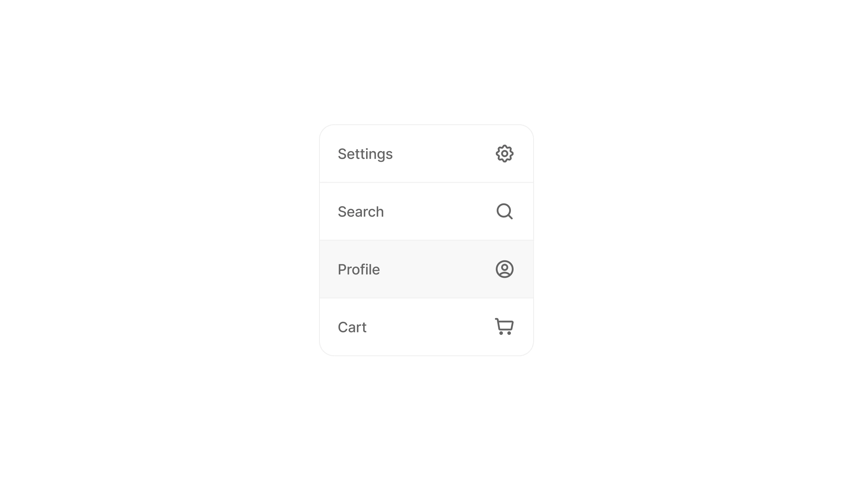
People spend most of their time using other products, so they naturally expect yours to follow familiar patterns.
A gear means Settings. A magnifying glass means Search. A profile icon means Account. These patterns feel obvious because we've seen them everywhere.
You can reinvent them, but you'll probably confuse more people than you impress.
Design Tip: Familiarity reduces friction.
4. Tesler's Law
Complexity is unavoidable. Hide it well.
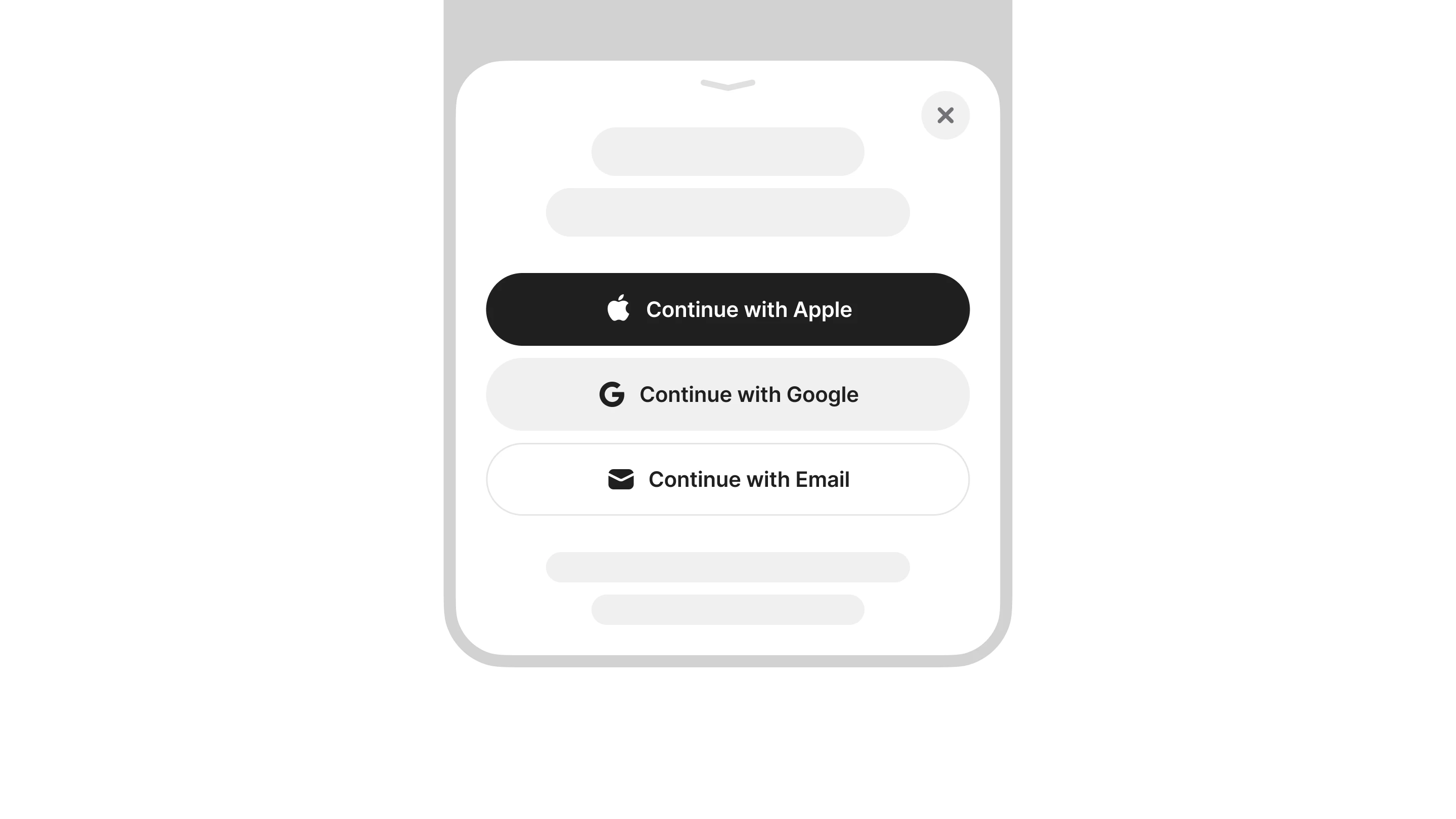
Every product has some complexity. The goal isn't to remove it—it's to keep it out of the user's way until they actually need it.
Think about signing in. There can be passwords, verification codes, social logins, security checks, and recovery options happening behind the scenes. Users don't need to see all of that at once.
Good UX handles the complexity in the background and gives users only what they need at that moment.
Everything else can come later.
Design Tip: Keep the first step simple. Reveal complexity only when it's needed.
5. Aesthetic–Usability Effect
Beautiful products feel easier to use.
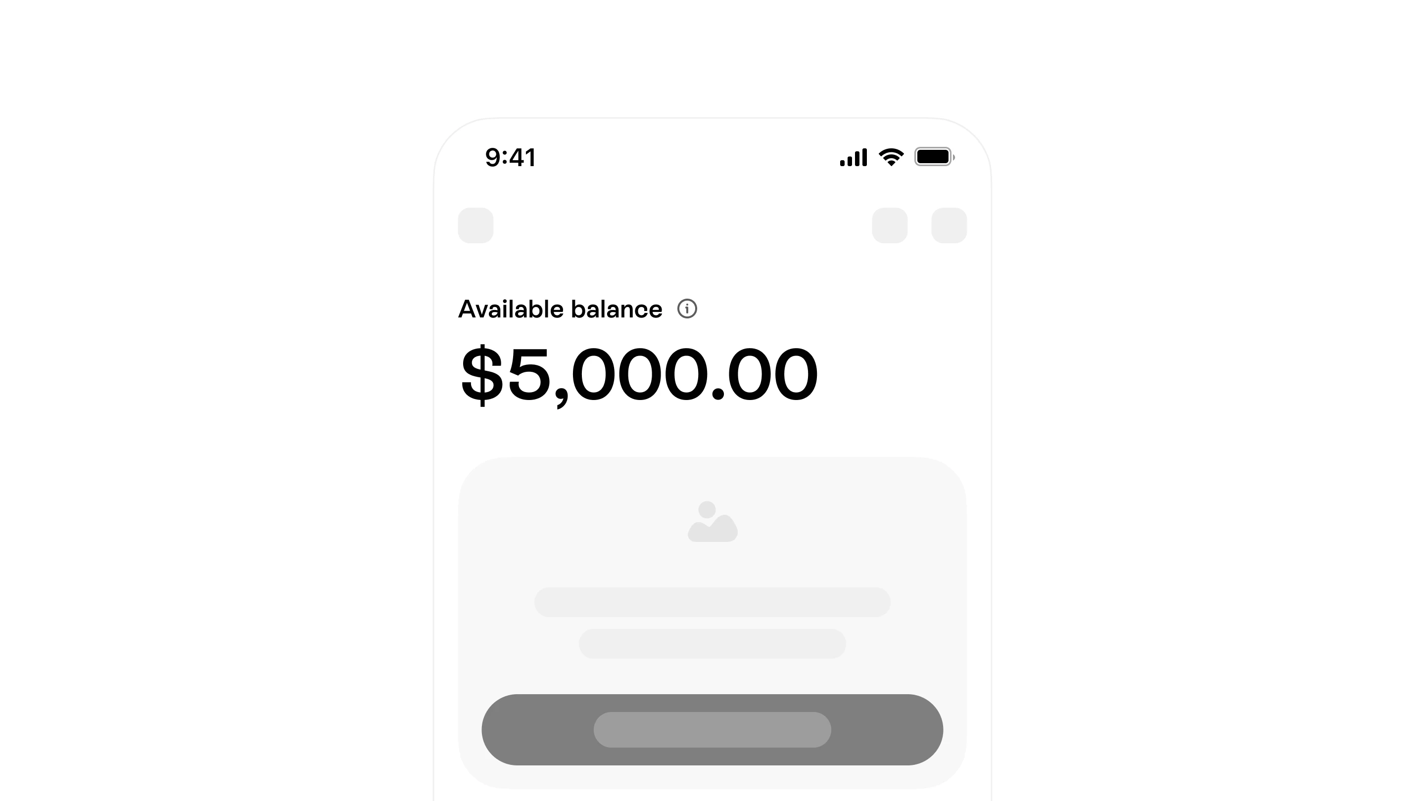
When an interface looks polished, people naturally perceive it as easier and more trustworthy. They’re also a little more forgiving when something isn't perfect.
Think about Apple, Notion, or Linear. Their clean, thoughtful visuals make the whole experience feel smoother.
Good design isn't just decoration—it builds confidence.
Design Tip: Make it useful first, then make it feel good.
6. Cognitive Load Theory
Don't make users think more than they have to.

Every extra field, option, or decision adds mental effort. The more users have to process, the harder it becomes to complete a task.
Imagine a sign-up form asking for your name, phone number, city, occupation, and address before you even get started.
Now compare that with a form asking for just your email and password. Which one would you finish?
Design Tip: Ask for the minimum. Collect the rest later.
7. Recognition Over Recall
Show users what they need instead of making them remember it.
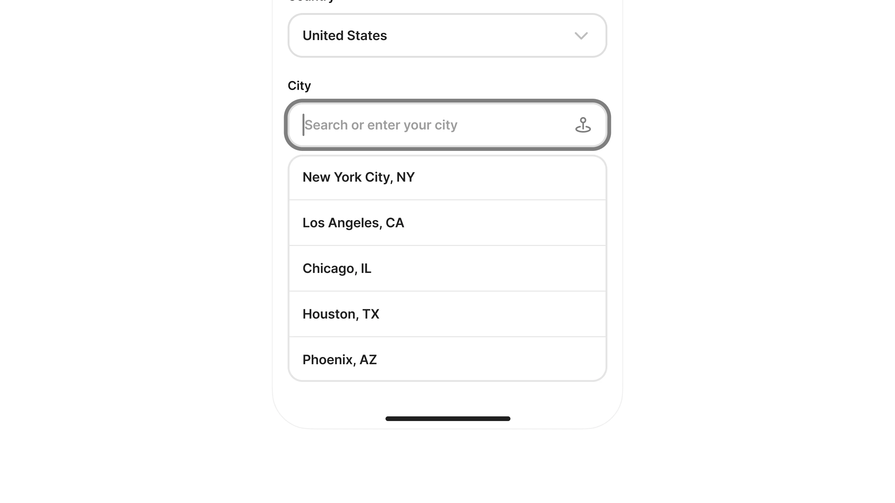
People recognize things much faster than they remember them. Showing familiar options makes decisions easier and reduces the effort needed to complete a task.
That's why autocomplete, recent searches, suggested files, and password managers feel so effortless.
Good UX supports memory instead of testing it.
Design Tip: Show options instead of making users remember.
8. Gestalt Principles
People naturally group related things together.
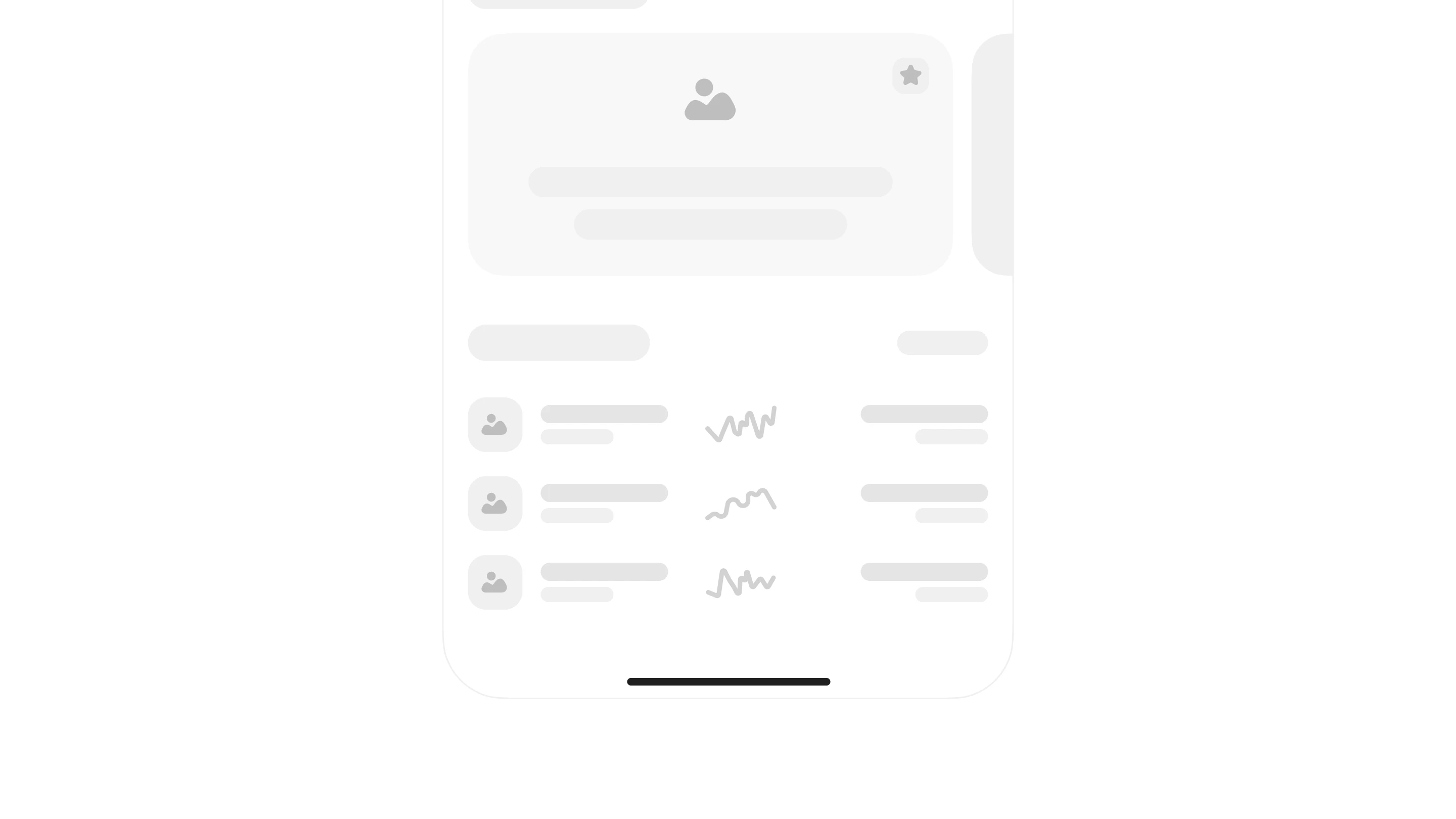
Our brains naturally organize information into groups. Designers can use this to make interfaces easier to scan and understand.
Place labels close to their inputs. Keep related content together. Use consistent colors and spacing for similar actions.
Small visual decisions can make a big difference in how quickly users understand a screen.
Design Tip: Organize before you decorate.
Final Thoughts
The best products don't rely on one UX principle, they combine several.
A simple interface, familiar patterns, low cognitive load, and thoughtful visual hierarchy all work together to create experiences that feel effortless.
The next time you're designing a screen, don't just ask: “Does it look good?” Ask: “Does it feel natural to use?” That's where great product design begins.