AD Blocker
In Q1 2026, I redesigned the overall app for better onboarding completion, blocker activation, and subscription experience for Ad Blocker. The redesign focused on reducing setup friction, improving user trust, and making privacy protection easier to understand.
Following launch, onboarding completion increased from 82% to 96%, premium conversion improved from 5.8% to 7.61%, and ARPU increased from $1.18 to $1.57.
// Role and Timeline
Product designer
4 weeks (Q1, 2026)
// Team
Bhagyashri, Product manager
Ameya, iOS developer
Aditi, Marketing
Dhruvil, QA
// Responsibilities
Competitor research
UX strategy
Mini design system
Product design
Usability testing
Accessibilty testing
Paywall A/B test
// Tools
Figma, Design tool
Lottie Files, Micro animations
ChatGPT, UX writing and critics
Slack, Communication
Clickup, Sprint and progress
Problem Statement
Most users downloaded the app expecting immediate protection. Instead, they encountered setup friction, technical terminology, and little feedback after activation. Without clear confirmation that protection was working, users struggled to see the product's value.
Goal
Help users get protected faster, understand the value of ad blocking, and feel confident that the product is working.
Research & Insights
Through competitor analysis, App Store reviews, and UX audits, three recurring patterns emerged.
User wanted proof
People didn't want to configure filters or learn technical settings. They wanted reassurance that ads and trackers were actually being blocked.
Activation created unnecessary friction.
Many users dropped off before enabling Safari protection because the setup process felt complicated.
Premium value wasn't obvious.
Users understood ad blocking, but struggled to see the difference between free and premium protection.
The Solution
Designed a simplified onboarding and activation experience that makes protection status visible and helps users understand the impact of ad blocking.
Information Architecture
Organized the experience around a simple flow: Setup → Activate Protection → Monitor Activity → Upgrade for Advanced Protection
Key Features
Added core utility features such as ad blocking, tracker protection, privacy insights, Safari integration, custom filters, and protection analytics.
The Final Product
A privacy-first ad blocker that helps users browse faster, reduce distractions, and stay protected from trackers across the web.
Logo Psychology
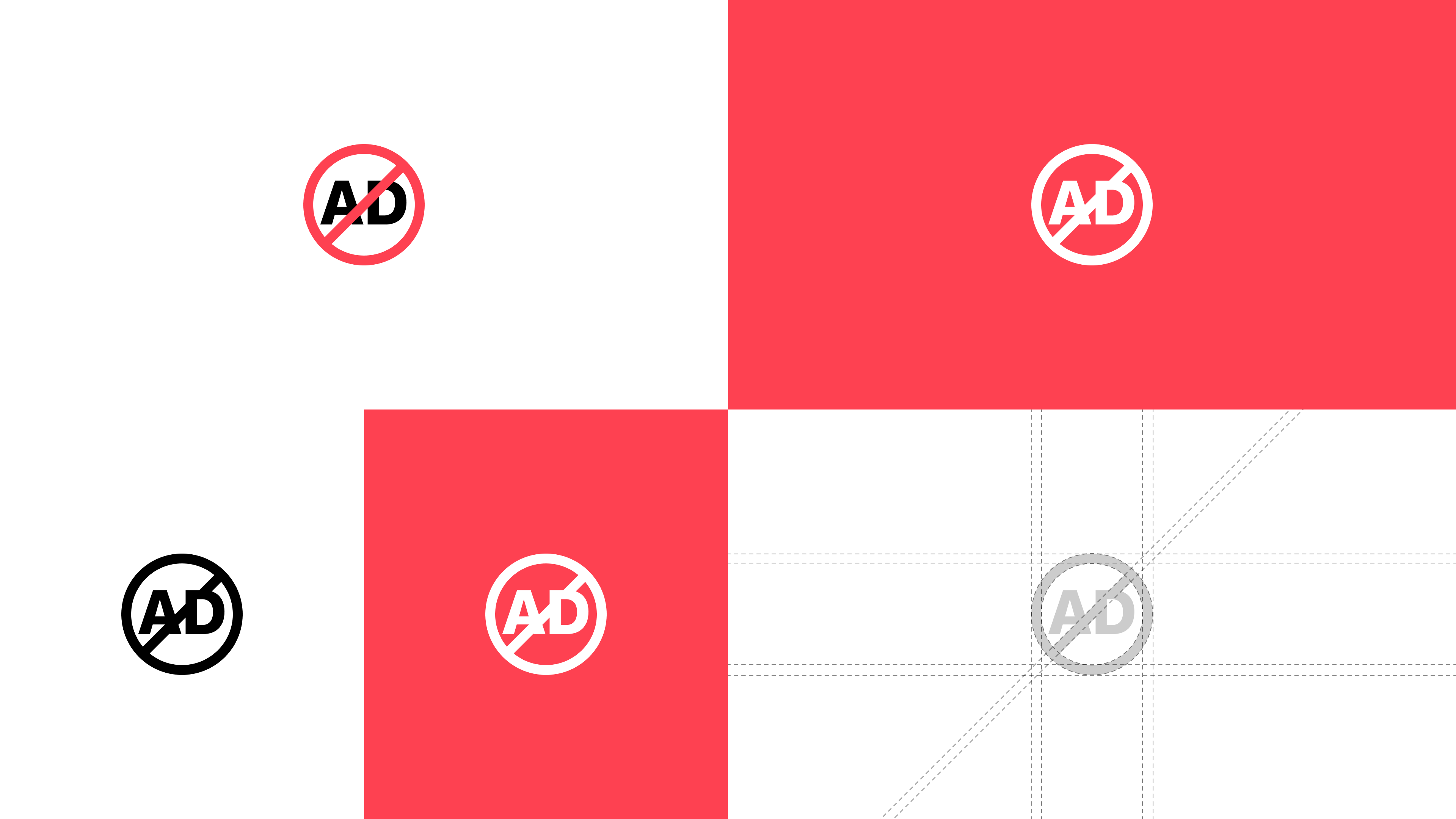
The logo is designed around the idea of protection, and a distraction-free browsing experience. The visual combines a familiar blocking symbol with the app's initials to create an identity that feels instantly recognizable.
Thought behind app icon
Clear Purpose
The icon immediately communicates ad blocking through a familiar visual language, reducing the need for explanation.
Instant Recognition
The bold shape remains recognizable across different sizes, from App Store listings to home screen icons.
Simplicity
A minimal visual system mirrors the product's goal of removing unnecessary distractions from the browsing experience.
User Control
The blocking symbol reinforces the idea that users have greater control over what appears while browsing.
Smart Protection Dashboard
One of the biggest usability issues uncovered during research was that users couldn't tell whether protection was actually working.
Since ad blockers operate quietly in the background, many users installed the app, completed setup, and never received confirmation that ads and trackers were being blocked.
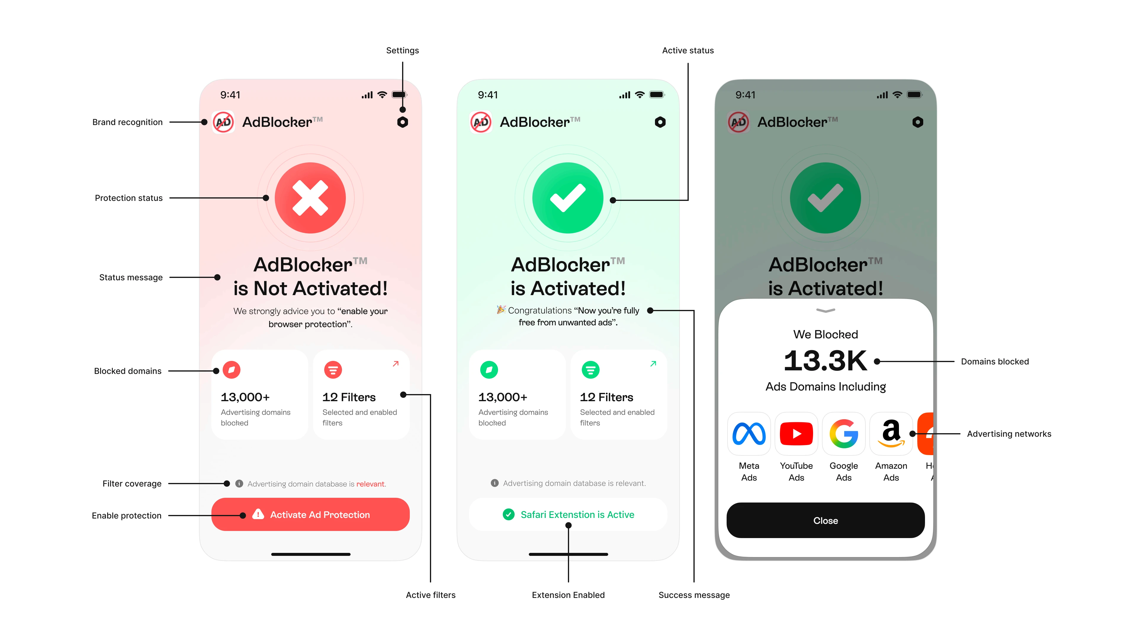
The redesigned dashboard focused on making protection visible through real-time status indicators, protection metrics, and actionable feedback.
During usability testing, many people asked a simple question: "How do I know it's actually working?"
The Smart Protection Dashboard was designed to answer that question immediately. By surfacing protection status, blocked domains, and active filters, the dashboard turns an invisible background process into a visible and trustworthy experience.
Protection at a glance.
Clear Activation Status
Large visual indicators provide immediate feedback on whether protection is enabled, reducing uncertainty after setup.
Real-Time Protection Feedback
Users can see active filters, enabled protection layers, and browser extension status without navigating through settings.
Blocked Domain Insights
Displays the number of advertising and tracking domains blocked, helping users understand the scale of protection happening behind the scenes.
Trust Through Transparency
Instead of simply saying "Protection Active," the dashboard shows measurable results, increasing confidence and perceived product value.
Faster Path to Activation
Users who haven't completed setup are guided toward activation through contextual messaging and prominent calls-to-action.
Continuous Value Reinforcement
Protection metrics, active status indicators, and blocked domain insights remind users of the value they're receiving every time they open the app.
A/B Testing Paywall
Converting users in utility apps is challenging because the value often remains invisible until after activation. During the redesign, I explored two different approaches to communicating premium value and reducing subscription friction.
The goal was to understand whether users responded better to a traditional feature-led paywall or a contextual paywall tailored to their immediate intent.
UX Goal:
Increase premium conversion by aligning value communication with user motivation and browsing behavior.
Paywall experiment

UX Psychology
Variant A: (Feature-led approach)
A traditional paywall focused on communicating the breadth of premium protection.
Psychology applied:
Feature transparency, benefit stacking, price anchoring, trust building and reduced uncertainty
This approach helps users evaluate the overall value of the subscription before making a decision.
Variant A: (Feature-led approach)
Designed specifically for users exploring YouTube ad-blocking features.
Instead of presenting a long list of features, the paywall focused on the outcome users were actively seeking: uninterrupted video viewing.
Psychology Applied:
Intent-based messaging, visual value demonstration, goal completion bias, endowment effect and reduced cognitive load.
This approach connects premium benefits directly to the user's immediate goal.
Advanced Protection Filters
While basic ad blocking solves a common pain point, users often need greater control over what gets filtered and blocked across their browsing experience.
The redesigned filter management system makes advanced protection easier to discover and configure, helping users personalize their privacy and browsing experience without navigating complex settings.
UX Goal:
How might we make advanced protection accessible without overwhelming everyday users?
Simplified filter controls
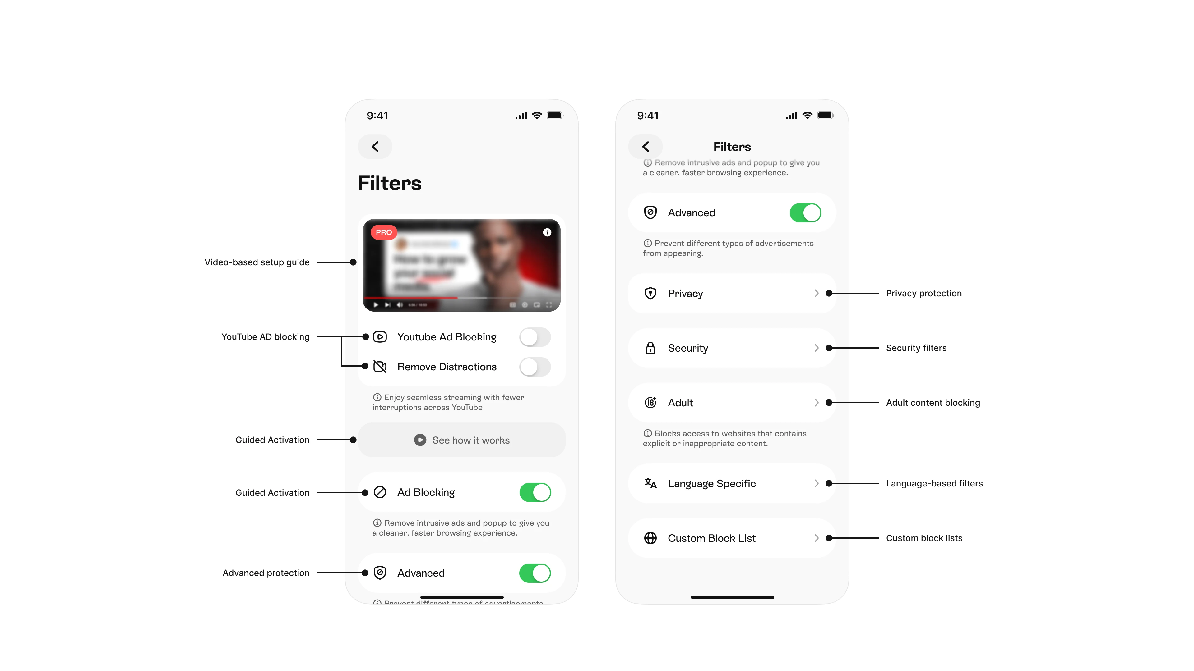
YouTube Ad Blocking
Removes intrusive ads and interruptions during video playback for a smoother viewing experience.
Guided Setup Experience
Embedded walkthroughs help users understand how protection works and how to get the most out of available filters.
Advanced Protection
Provides additional filtering layers to block trackers, popups, and unwanted web elements.
Privacy Filters
Protects users from tracking technologies and data collection across websites.
Security Protection
Blocks known malicious domains and helps reduce exposure to potentially harmful content.
Custom Filtering
Allows users to create personalized block lists and tailor protection to their browsing preferences.
UX Insight:
Many users wanted stronger protection but felt overwhelmed by technical terminology. Simplifying filter categories and explaining benefits instead of features made advanced controls easier to understand and use.
Custom Block List
A flexible filtering system that allows users to create personalized keyword and website block rules for greater control over their browsing experience.
UX Goal: Enable advanced customization without making protection difficult to manage.
UX Goal:
Enable advanced customization without making protection difficult to manage.
Balancing customization with simplicity.
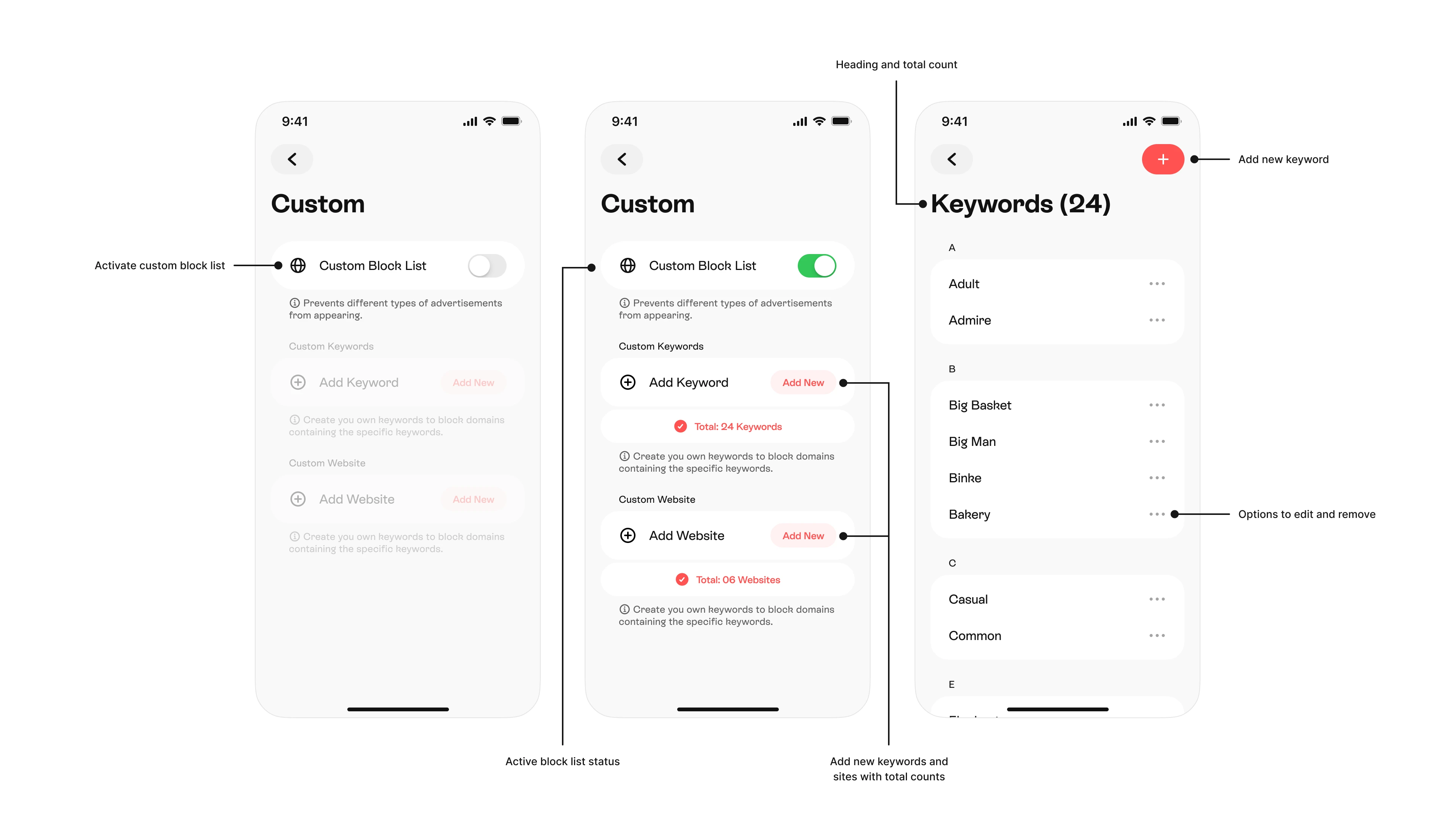
UX Insight:
Users wanted greater control over their browsing experience, but creating custom rules often felt too technical. By simplifying keyword and website management into familiar actions, advanced customization became easier to understand and adopt.
Before → After
Rather than introducing new features, the redesign focused on making existing functionality easier to discover, understand, and trust.
Before
Complex Safari setup
Technical language
Hidden protection
Feature-first paywall
Unclear value
After
Guided activation
Benefit-focused copy
Visible protection indicators
Outcome-driven paywall
Measurable protection insights
Impact and Metrics
Following the Q1 2026 redesign, key product metrics improved across onboarding, activation, conversion, retention, and revenue. The changes helped users reach value faster while creating a clearer path to premium adoption.
82% → 96%
Onboarding Completion Rate
Simpler onboarding reduced setup friction and helped more users reach activation.
+9%
Improved activation
Increased Safari activation success through guided setup instructions and visual cues.
5.8% → 7.61%
Premium Conversion
Improved premium conversion by communicating outcomes instead of technical features.
−42%
Reduced Support Tickets
Fewer setup-related issues after introducing a guided activation experience.
24% → 28%
Recurring Subscriptions
Improved retention through increased trust and perceived product value.
$1.18 → $1.57
ARPU
Average Revenue Per User increased through better onboarding and subscription positioning.
Big Picture Impact
A simpler activation experience, stronger user trust, and measurable improvements across conversion, retention, and revenue.
↑ 14% Overall experience
↑ 21% Day 30 retention
↑ 18% Daily active user.
What i learned
One of the biggest lessons from this project was that users don't care about ad-blocking technology—they care about outcomes.
Final Outcome
Users installed Ad Blocker to solve a simple problem: browse without interruptions. The redesign removed unnecessary complexity, introduced clearer protection feedback, and gave users greater control over their browsing experience. As a result, users reached activation faster, trusted the product more, and engaged with advanced protection features more often.
UX Impact:
Cleaner browsing. Clearer protection. More confidence.
Guided Onboarding
Real browsing scenarios help users understand the value of ad blocking before setup, making the first experience easier to understand and complete.
UX takeaway:
Show the benefit before the feature.

Settings & Guide
Grouped settings and built-in guides simplify activation, helping users enable protection without leaving the app.
UX takeaway:
Guide users when they need help most.
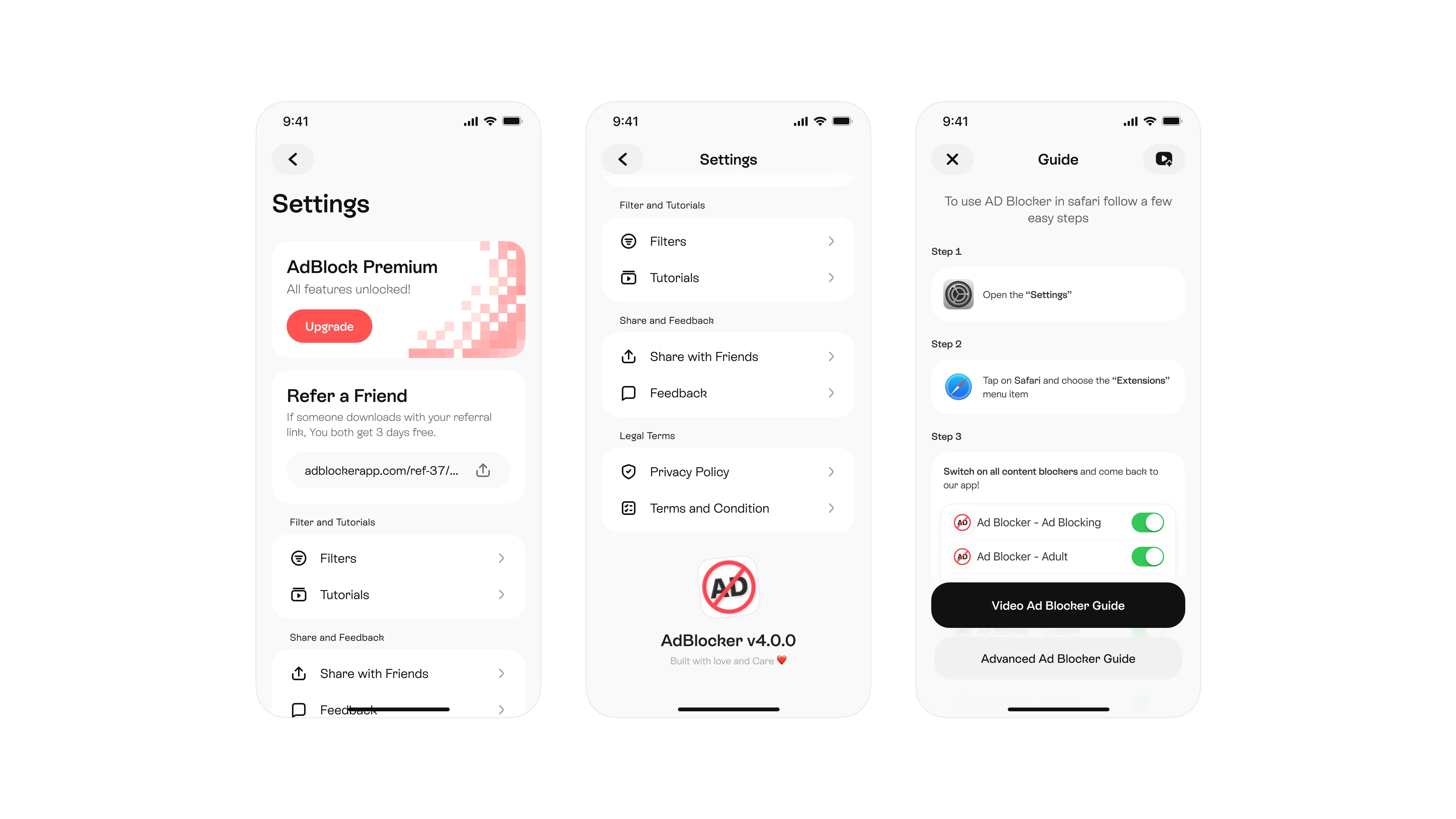
Feedback & Activation
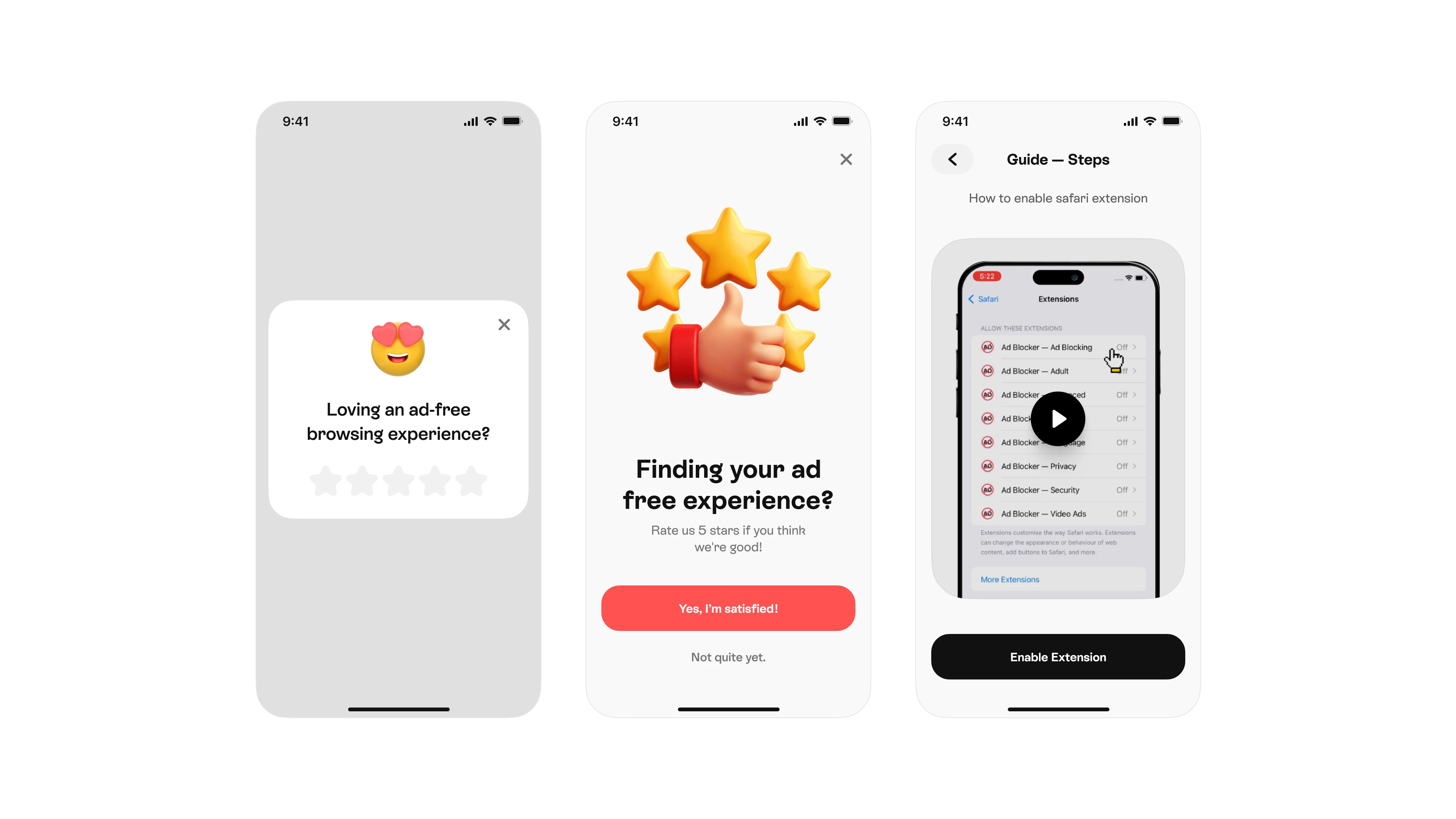
Ratings are requested after users experience the product, while video guides reduce setup issues through clear visual instructions.
UX takeaway:
Earn trust before asking for feedback.